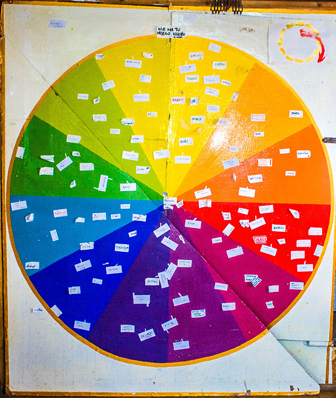
Colours of emotions
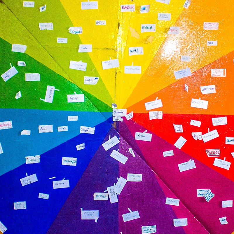
There is a picture in the first room where I ask guests to think about emotions they associate with the presented colours. They can stick cards with their emotions to the right colour and read what other feelings people experience here.
I wanted to achieve double effect here: raising awareness of emotions we experience and attaching them subconsciously to colours.
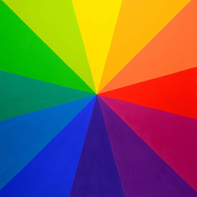
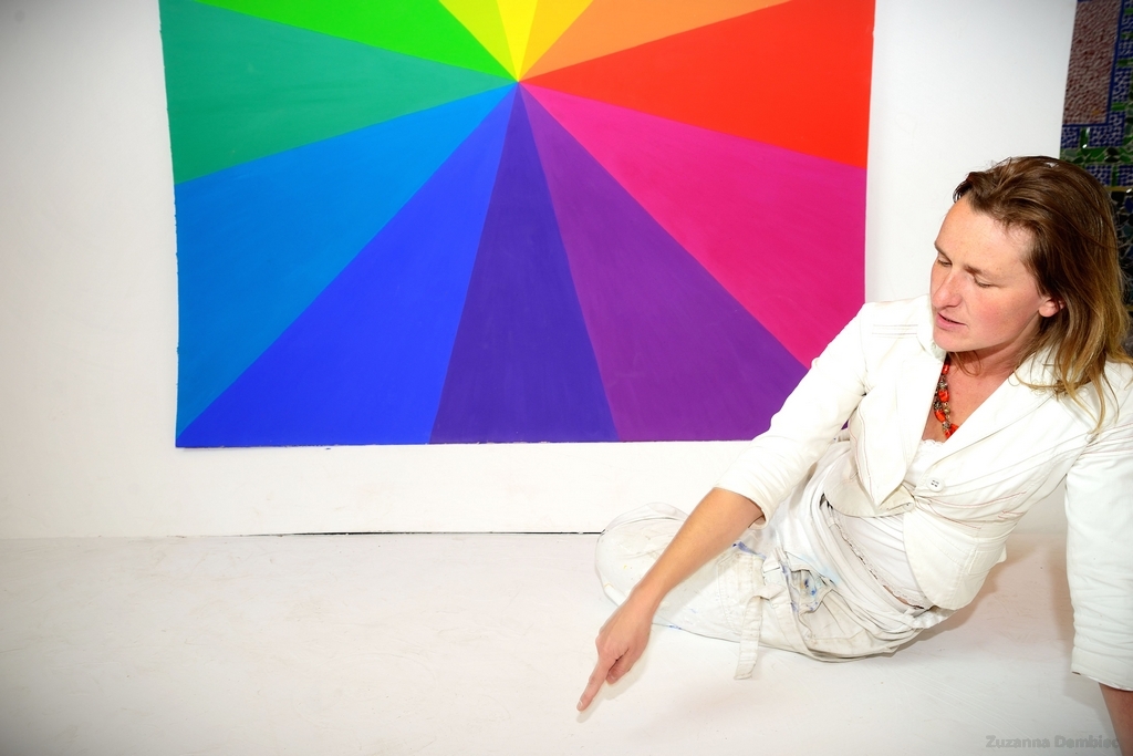
The next step is moving to a room with three paintings.
The purpose of these paintings is to influence synesthetically the arrangement of emotions in a man. None of them should dominate the others but each is able to find enough space for itself.
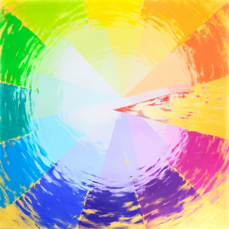
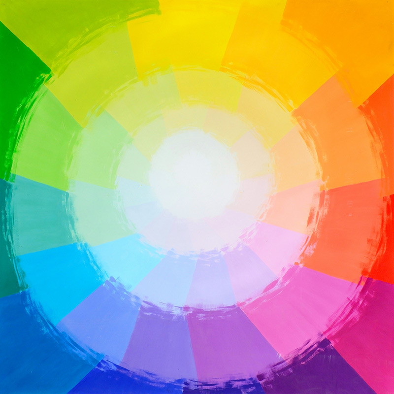
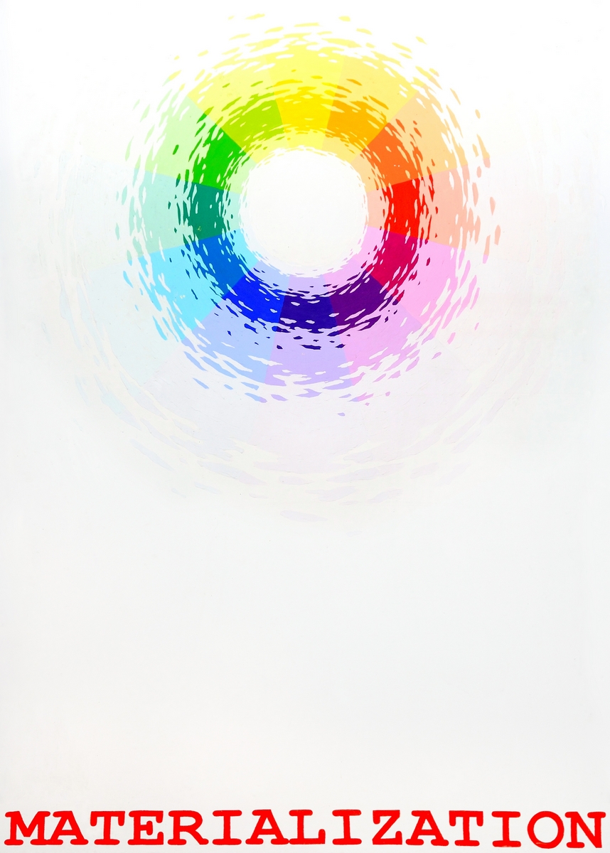
The first one is a saturated rainbow. Filled with colours which visitors worked on at the beginning. These are strong colours with great influence, the easiest to be noticed and described with emotions and words.
I tried to choose these colours harmoniously so that (theoretically) after spinning they turned into white. If any of the colours prevailed, the spinning colour would turn into bluish, greenish or even pink.
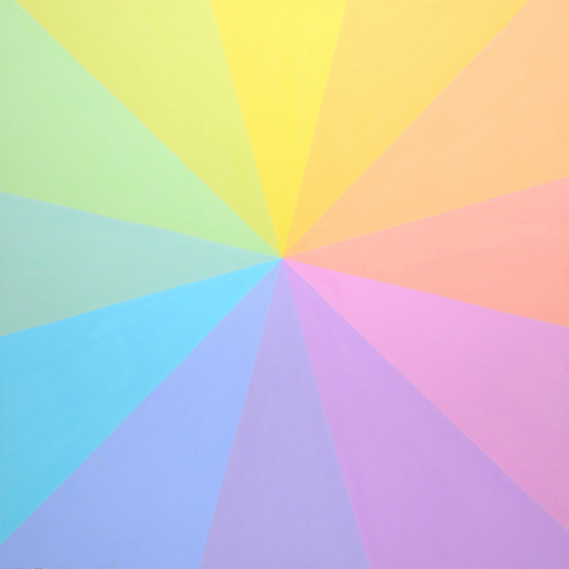
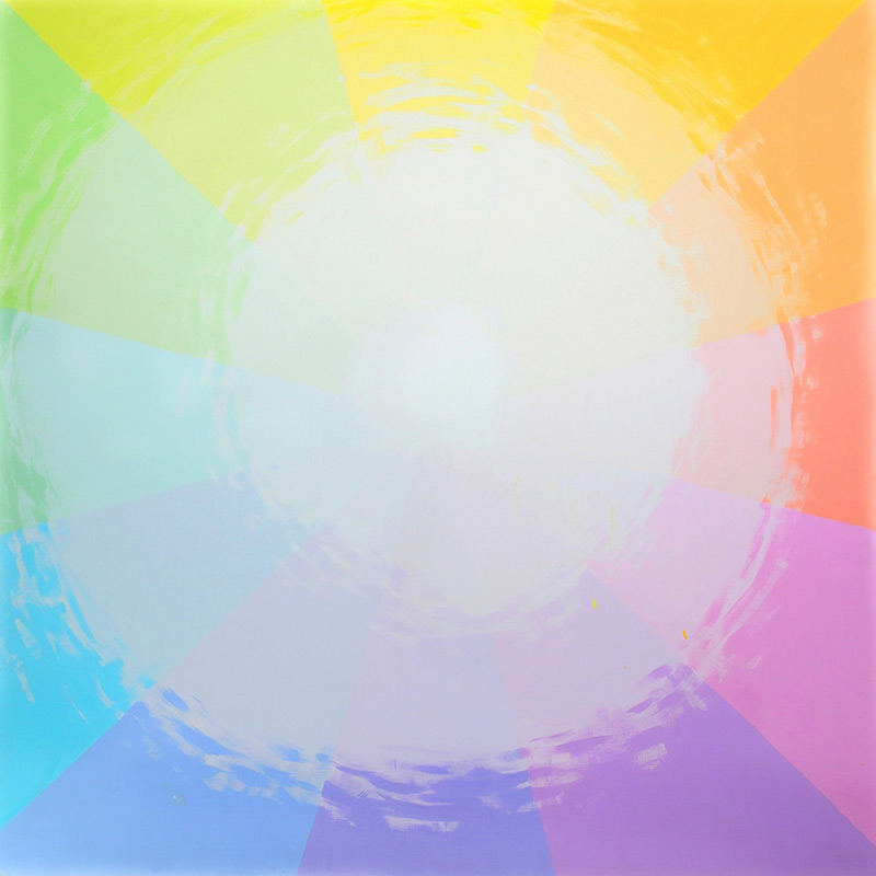
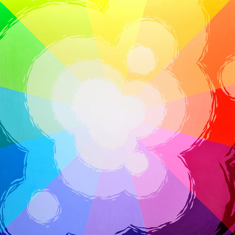
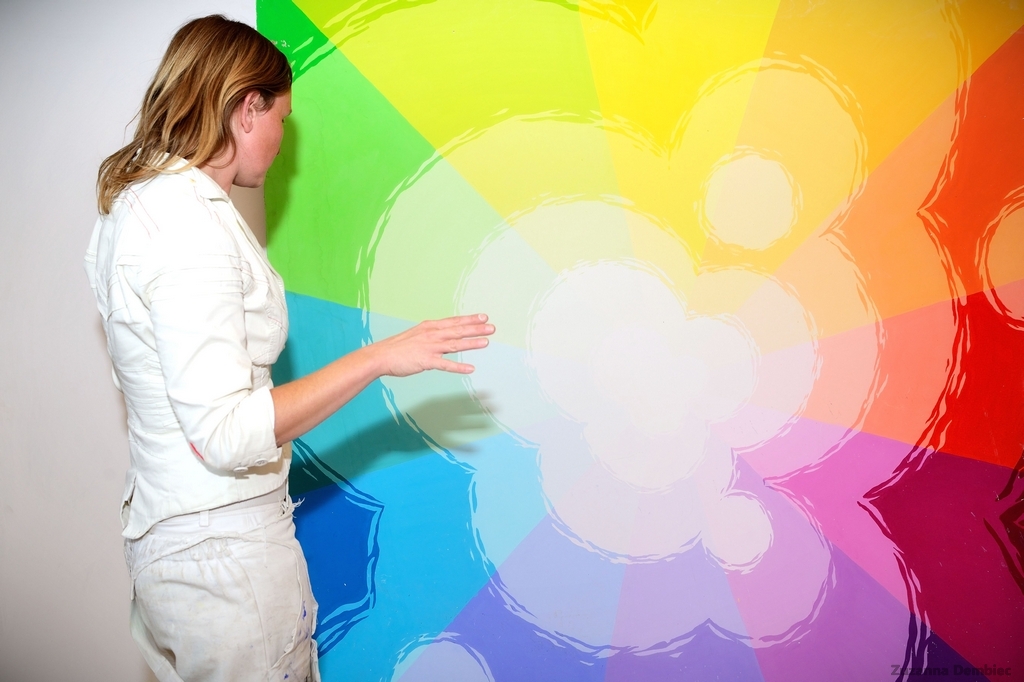
The second one is a pastel rainbow.
Approaching the second picture turns out to be surprising and easy to notice emotionally for the visitors. They often talk about distance to their own emotions, opening the possibility of controlling them and about peace and contentment which appear along the way.
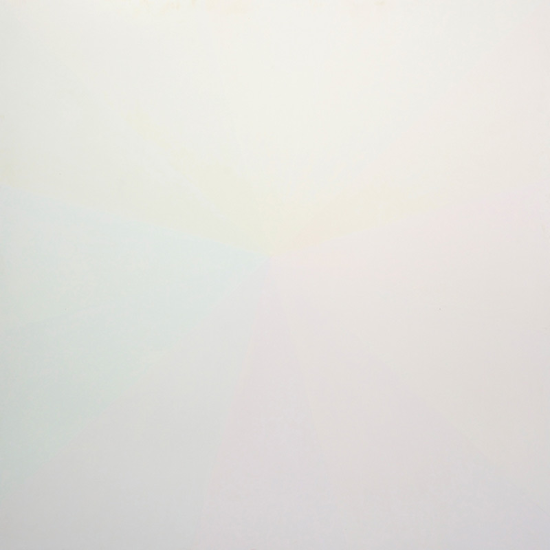
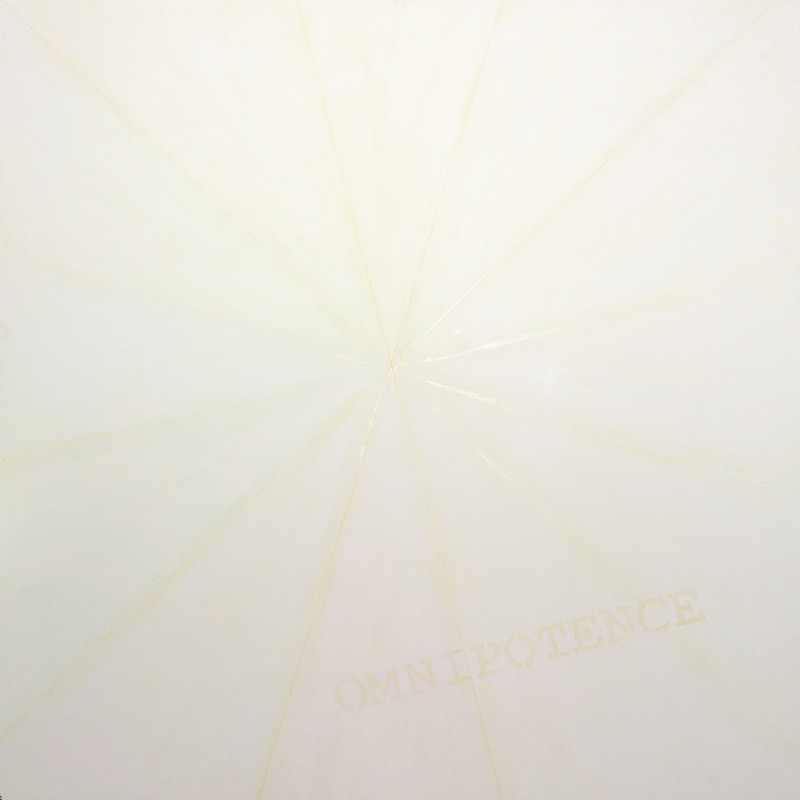
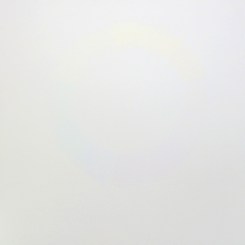
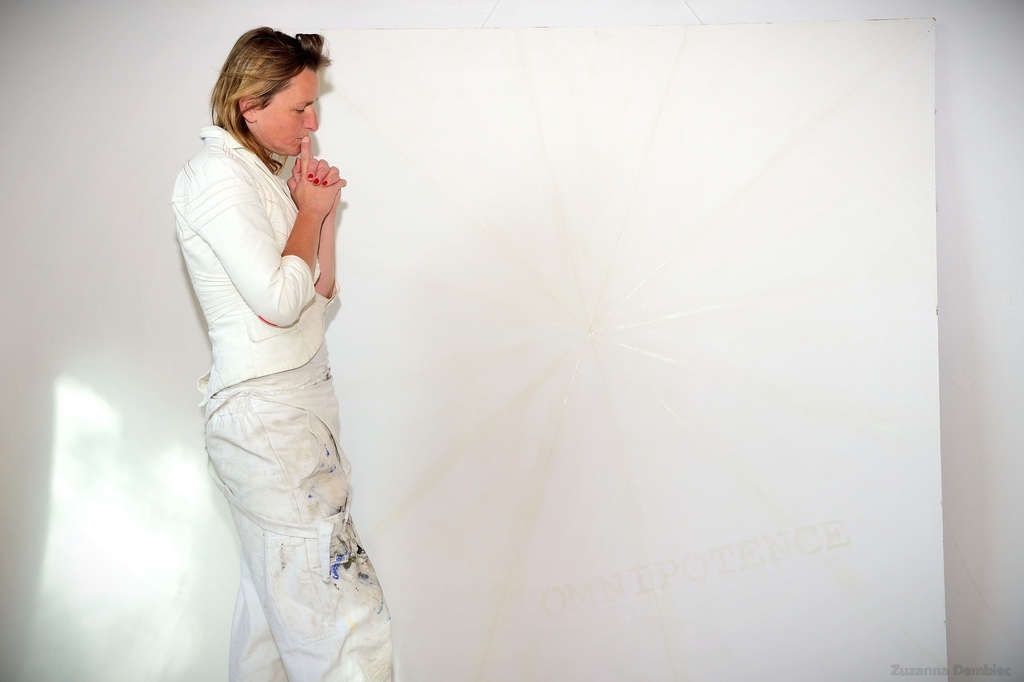
The third picture s e e m s to be white …
For me it is a deep enlightenment.
Several times I have experienced and felt this deep understanding, sometimes awakening, touch of obviousness. I have also had a chance to observe it in my reactions of my guests.
The rest leaves space for the game of illusion and imagination.